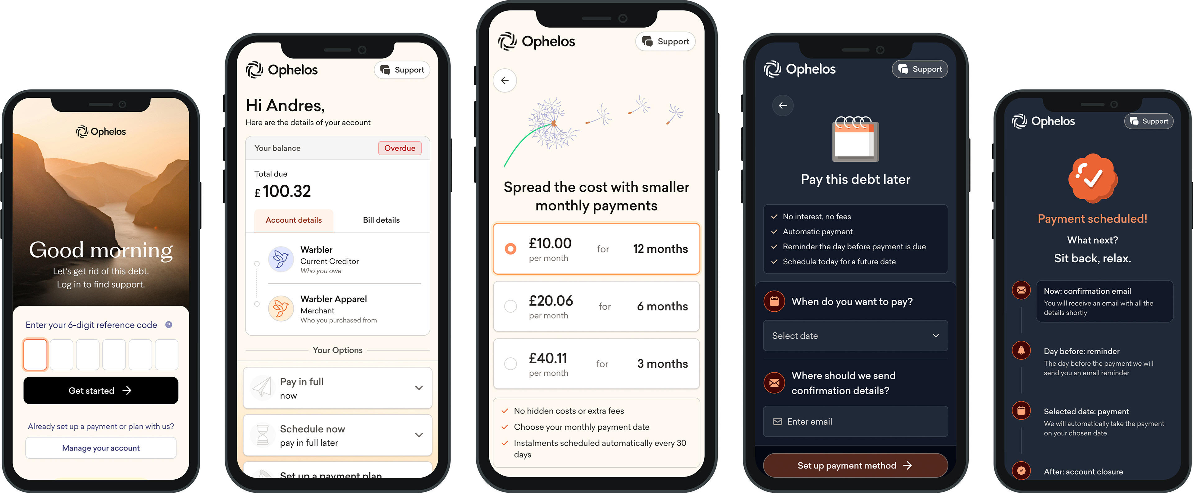
As a UX designer at Ophelos, a fintech company focused on transforming the debt resolution experience, I have had the opportunity to continuously work on our B2C app, an essential product that allows customers to manage their debt independently.
This project was all about designing for real people in difficult and vulnerable situations. The goal: create a fully self-serve platform where users could receive communications, log in seamlessly, and take control of their finances, without needing to speak to an agent if they didn’t want to.
In this case study, I’ll walk through how we approached this challenge, the design decisions I made, and how we used empathy and thoughtful UX to build an experience that’s clear, human, and empowering.
The Problem
For many people, dealing with debt can be emotionally overwhelming and traditional solutions often make it a lot worse. Long wait times, confusing or aggressive letters, and the constant pressure to speak with agents on the phone can add a lot of stress.
Ophelos set out to reimagine this experience: What if users could manage their debt in a way that felt more like using a modern banking app, with options of how to deal with their debt ranging from bespoke payment plans, to scheduled payments in the future.

The Goals

· Build a fully self-serve experience where users can understand and manage their debt independently.
· Design with empathy, using calm, simple visuals and non-judgmental language.
· Enable users to take action with clarity, whether that's setting up a payment plan or asking for support.
· Adapt the app to reflect our new brand identity, following a full company rebrand in 2024.
· Continuously evolve the experience through iterative improvements and new features.
My Role
As the lead UX designer on this project, I’ve been deeply involved from initial discovery through to ongoing iteration. My responsibilities include:
· Defining user journeys and flow architecture
· Creating low- to high-fidelity prototypes
· Conducting in-depth user testing and interviews· Collaborating with product, engineering, and operations teams
· Leading the brand design update post-rebrand
· Shipping new features regularly to meet user needs
· Drawing inspiration from wellness and meditation apps like Headspace and Balance to create a calm and supportive UX

Research & User Testing
User insight is at the heart of everything we build. We've run continuous cycles of testing using a mix of:
1:1 user interviews with live customers across different demographics and financial backgrounds
Remote usability testing through platforms Lyssna & Userbrain
Surveys and feedback loops embedded directly into the app
Designing for Calm
Managing debt is a deeply emotional experience. That’s why we looked to calming, wellness-first products for inspiration. The influence of apps like Headspace and Balance can be seen in:
Soft, spacious UI with soothing colors
Micro-interactions that feel reassuring, not abrupt
Copywriting that’s supportive, not robotic
A flow that respects the user’s pace and decisions
This emotional design philosophy helped us build trust and make the app feel safe, not stressful.

Designing a easy-to-use aesthetically calming budget assessment flow (for high vulnerability customers)
Design Process
Mapping the End-to-End Experience
I started by mapping the full journey: from the moment a user receives a communication from Ophelos to the resolution of their account. This helped identify pain points and emotional peaks along the way.
2. Prototyping & Testing
I created wireframes and prototypes for key flows, then tested them across both moderated and unmoderated environments. We paid close attention to emotional cues—were users hesitating, confused, or relieved?
3. Visual & Interaction Design
Inspired by meditation apps, the design uses soft colors, rounded edges, and clean UI to help users feel calm and in control. The language is clear, conversational, and supportive. During our rebrand, I led the UI refresh to align with new typography, color palettes, and tone guidelines.
4. Iteration & Feature Expansion
This app is a living product. I regularly ship new features—like repayment flexibility, smart reminders, and help center access—while continuously refining existing flows based on feedback.
Final Design Mockups
